
JOIN OUR NEWSLETTER
Subscribe to our newsletter to stay informed
about our latest work and studio news. As well as
information on current positions and internships.
Share +

2023.09
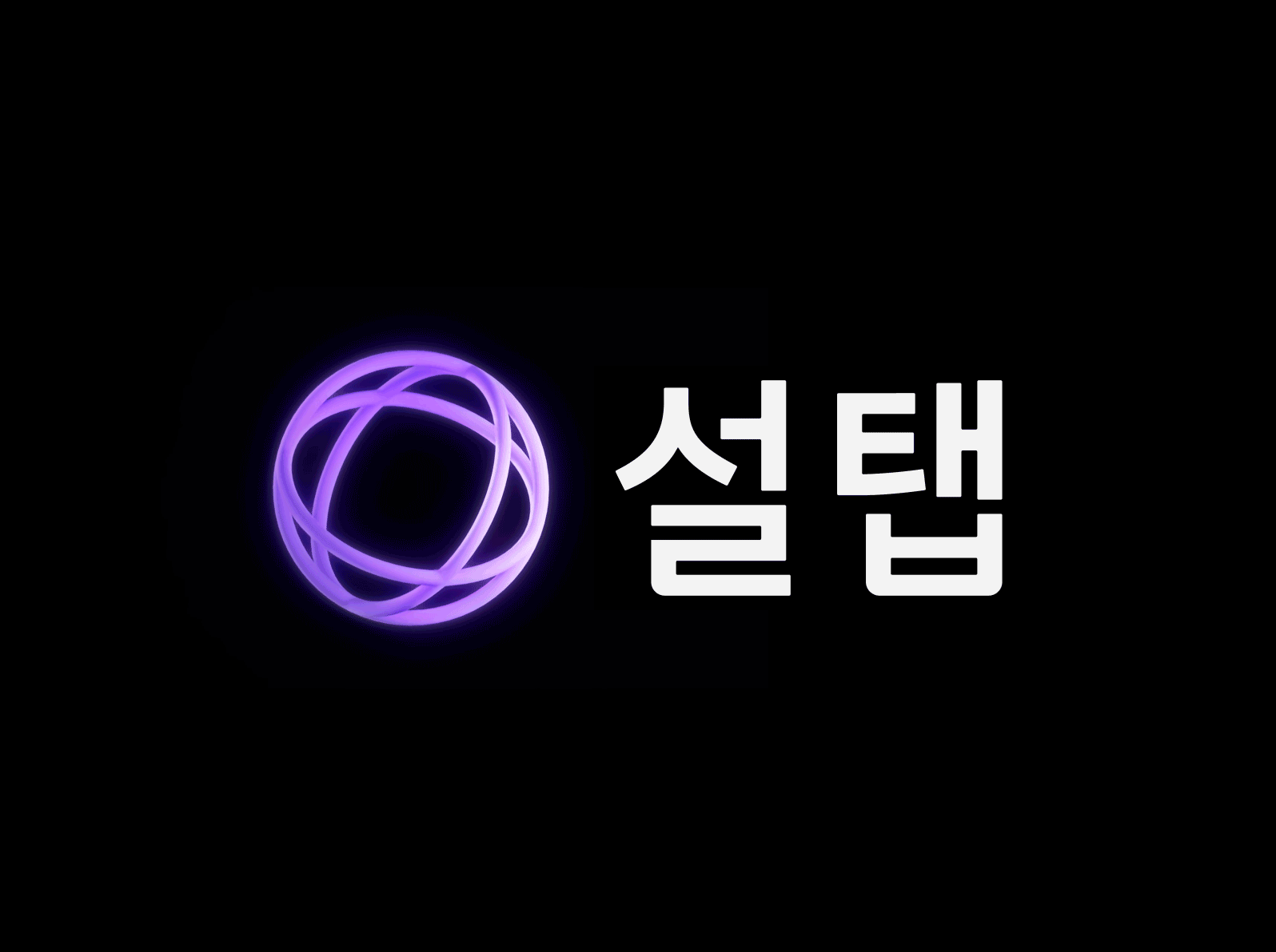
Seoltab
설탭
-
CLIENT
(주)오누이
-
INDUSTRY
Education -
SERVICE
Creative Strategy ,
Branding(BI)
-
THE CLIENT
클라이언트
Operated by Onui, Seoltab is an educational platform that provides non-face-to-face tutoring services for middle and high school students. It is a personalized learning platform leveraging both Human Touch (HT) and Digital Transformation (DT). Bringing offline tutoring sessions to the online space, Seoltab facilitates 1:1 tailored non-face-to-face learning services for students and teachers, overcoming the constraints of time and space. Through a blended learning approach that combines the advantages of 1:1 interactive teaching and digital instruction, Seoltab assists students in discovering their strengths and developing specialized knowledge and skills. Even without direct physical meetings, Seoltab considers the preferences and levels of students to match them with verified top tutors. Utilizing AI, Seoltab enables personalized curriculum development for each student, allowing effective learning management. Seoltab aims to empower students with tailored interactions, helping them gain self-efficacy through personalized experiences. It fosters a positive attitude towards problem-solving and cultivates the ability for self-directed learning, even without direct face-to-face interactions.
오누이에서 운영하는 설탭은 중고등 대상 비대면 과외 서비스를 제공하는 교육 플랫폼으로 휴먼 터치(HT)와 디지털 전환(DT)을 통한 개인 맞춤형 학습 플랫폼입니다. 오프라인 공간에서 만나 진행하는 과외를 온라인의 공간에서 구현시켜 학생과 선생님이 온라인에서 만나 시공간 제약을 뛰어넘는 1:1 맞춤형 비대면 학습 서비스를 제공합니다. 1:1 상호작용 수업방식과 디지털 수업 방식의 장점만 결합한 블랜디드러닝 학습법을 통해 학생들이 자신의 강점을 발견하고 특화된 지식과 기술을 개발하도록 도와줍니다. 직접 만나지 않아도 학생의 성향과 수준을 고려하여 학생들에게 맞는 검증된 최상의 튜터를 매칭하며, AI를 통해 학생 개개인에 게 맞는 맞춤형 커리큘럼에 따라 학습 관리가 가능합니다. 설탭은 학생들이 맞춤형 상호작용을 통해 자기 효능감을 얻을 수 있도록 도와주며 문제를 대하는 긍정적인 태도와 자기 스스로 학습할 수 있는 능력을 키울 수 있도록 해줍니다.
-
THE OBJECTIVE
목적
Due to differentiation from other education platform brands and the expansion of its business scope, Seoltab recognized the necessity for rebranding. Since its launch, Seoltab had emphasized the non-face-to-face tutoring service nature to appeal to customers and convey its brand image. However, it struggled to establish distinct values beyond functional aspects, unlike traditional private education brands. With the emergence of similar services, there were limitations in the service approach, and the lack of a clear brand philosophy and direction hindered effective customer communication. Seoltab aimed to strengthen its brand identity through a visual identity renewal and establish proactive communication methods with consumers. YNL Design developed a visual identity system throughout the project to clearly convey the brand values Seoltab sought, visually representing Seoltab's blended learning approach.
설탭은 타 교육 플랫폼 브랜드와의 차별성과 사업 영역의 확장으로 인해 리브랜딩의 필요성이 대두되었습니다. 설탭은 론칭 이후 비대면 과외 서비스적 특성을 고객에게 어필하며 소비자들에게 브랜드 이미지를 전달하였습니다. 하지만 전통적인 사교육 브랜드와 같이 기능적인 측면만 강조될 뿐 차별적인 가치가 뚜렷하지 않았습니다. 비슷한 서비스들의 등장과 함께 서비스 방식에 있어 한계가 있었으며 명확한 브랜드 철학과 방향성이 없어 이를 바항으로 한 고객 커뮤니케이션에서도 한계를 느끼게 되었습니다. 설탭은 비주얼아이덴티티 리뉴얼을 통해 브랜드 정체성을 강화하며 소비자들과의 적극적인 커뮤니케이션 방식을 정립하고자 했습니다. YNL Design은 프로젝트 전반에 걸쳐 설탭이 추구하는 브랜드 가치를 명확하게 전달하며 설탭의 블랜디드 학습을 시각적으로 표현할 수 있는 비주얼 아이덴티티 시스템을 개발하였습니다.
-
THE SOLUTION
해결방안
YNL Design developed the visual identity with the design concept "The Microcosm in Universe," comparing the brand essence of Seoltab to the mysterious and vast galaxy, where numerous lights gather. The previous symbol, representing 'S' for Seoltab in handwritten style, emphasized the Seoltab service. The newly developed symbol features three intersecting circles, symbolizing a single planet, representing the microcosm of each student's infinite potential. It signifies the discovery of something tangible, like finding the unseen potential of students. The 3D logo format conveys a sense of space and depth, highlighting the symbolic representation of the three circles, representing classes, textbooks, and management—the essential elements through which Seoltab discovers the potential of each student. The Seoltab logotype, primarily used in the digital realm, was developed to be visually comfortable and concise. It follows a geometric and organized grid structure to convey a systematic and trustworthy image. Rounded edges throughout the logotype contribute to a human touch (HT) aspect, delivering a soft overall image. Seoltab's colors visually express blended learning. Human Touch (HT), representing interaction with people, uses warm colors, particularly red symbolizing the heart, while Digital Touch (DT), representing a rational and technical aspect, is represented by the blue color. The blended combination of HT and DT results in Seoltab using purple as its main color for brand identity. Purple symbolizes the universe and, functionally, reduces eye strain for students and teachers studying on iPads, ensuring excellent usability. To facilitate user understanding and convenience in the expanding Seoltab system, a subject-specific color system was established. Seoltab's graphic motifs, extending from the symbol, offer flexibility for application across various platforms and applications.
YNL Design은 ‘Universe Potential’이라는 브랜드 에센스를 신비로운 미지의 영역이자 수많은 빛이 모여있는 우주(Galaxy)에 빗대어 ‘The Microcosm in universe’라는 디자인 컨셉으로 비주얼 아이덴티티를 개발하였습니다. 리브랜딩 이전의 심볼은 손글씨로 설탭을 뜻하는 ’S’가 담겨 있어 설탭 서비스에 중점을 두었습니다. 새롭게 개발된 심볼은 서로 다른 3개의 원이 접점을 가지고 어울려 하나의 행성을 나타내며, 학생 개개인의 무한한 잠재력이 담겨있는 소우주를 상징적으로 표현합니다. 학생들의 보이지 않은 잠재력을 발견한다는 무언가 실체를 발견했다는 의미로, 공간감과 입체감이 느껴지는 3D 로고 형태로 개발하였습니다. 심볼에서 보여지는 3개의 원은 수업, 교재, 관리를 의미하며 설탭에서 생각하는 교육 3요소이자 이를 통해 학생들의 잠재적인 가능성을 발견해 주는 핵심 요소를 나타냅니다. 설탭의 로고타입은 디지털 상에서 주로 사용하여 시각적으로 편안하고 간결하게 개발하였습니다. 체계적이며 신뢰있는 이미지를 전달하기 위해 기하학적인 형태와 정돈된 그리드 형태에 맞춰 표현하고자 했습니다. 로고타입 전체적으로 둥근 엣지를 더해 휴먼터치(HT)적인 면모와 함께 부드러운 이미지를 전달합니다. 설탭의 컬러는 블랜디드 러닝을 시각적으로 표현했습니다. 사람과의 상호작용을 뜻하는 휴먼 터치(HT)는 따뜻한 계열의 컬러이자 심장을 상징하는 붉은색을 나타내며 디지털 터치(DT)는 이성적이고 기술적인 면을 나타내는 블루 컬러를 나타냅니다. 휴먼터치(HT)와 디지털 터치(DT)가 블랜디드 되어 탄생된 설탭은 퍼플 컬러를 메인으로 사용하여 브랜드 아이덴티티를 나타냅니다. 또한 퍼플 컬러는 우주를 상징적으로 나타내며, 기능적으로 눈에 피로가 덜하여 학생과 선생님이 아이패드로 공부하는 과정에서 눈에 피로가 가지 않도록 하며, 사용성 측면에서도 우수합니다. 과목별 컬러시스템을 정립하여 확장되는 설탭의 시스템을 사용자가 명확하고, 편리하게 사용할 수 있도록 합니다. 설탭의 그래픽 모티브는 심볼에서 확장하여 다양한 어플리케이션에 유연하게 적용할 수 있습니다.


ENFORD HOTEL
Creative Strategy / Branding(BI) / Verbal Identity

NP
Creative Strategy / Branding(CI) / Verbal Identity / Web(UX&UI)
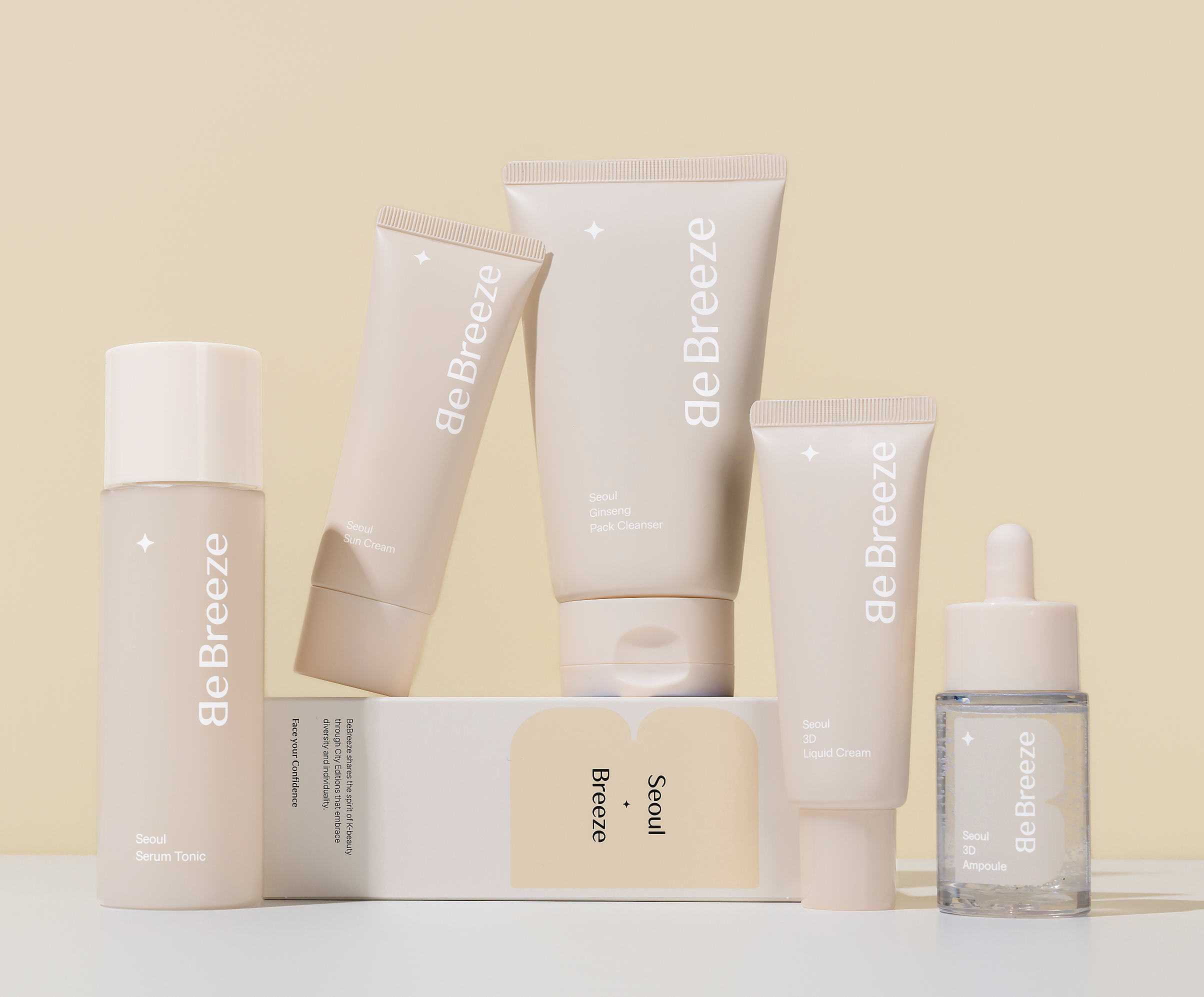
BE BREEZE
Creative Strategy / Branding(BI) / Verbal Identity / Packaging

MIINSILOK
Creative Strategy / Branding(BI) / Verbal Identity / Packaging

Liaison de LOREN
Creative Strategy / Branding(BI) / Verbal Identity / Packaging / Web(UX&UI) / Graphic / Illustration

SHIHYO
Creative Strategy / Packaging / Application

ORVIS
Creative Strategy / Branding(BI)

SHINHANCARD SOL TRAVEL
Creative Strategy / Graphic / Photography Direction

ROii&COii
Creative Strategy / Branding(CI) / Verbal Identity

Liaison de LOREN Website
Creative Strategy / Branding(BI) / Verbal Identity / Packaging / Web(UX&UI) / Graphic / Illustration

MAISON POESI
Creative Strategy / Branding(BI) / Verbal Identity

COSMOS LAB
Creative Strategy / Branding(CI) / Verbal Identity / WEB(UX&UI)

PILOTO MAISON
Creative Strategy / Branding (BI) / Verbal Identity

ROUGE&LOUNGE
Creative Strategy / Branding (BI)

UNIVERA
Creative Strategy / Branding(CI) / Packaging

O'2ND
Creative Strategy / Branding (BI) / Verbal Identity

TAXBACK
Creative Strategy / Branding(CI) / Verbal Identity / Web(UI)

STUDIO EON
Creative Strategy / Branding(CI) / Verbal Identity

Braindrop
Creative Strategy / Branding(CI) / Verbal Identity

ARTPOINT
Creative Strategy / Branding(CI) / Verbal Identity

KLEANICURE
Creative Strategy / Branding(BI) / Packaging

I'm eco
Creative Strategy / Packaging

TEAZEN Kombucha Sparkling Tea
Creative Strategy / Branding(BI) / Packaging

TEAZEN Kombucha
Creative Strategy / Branding(BI) / Packaging

SHINHANCARD SOL TRAVEL #02
Creative Strategy / Graphic / Photography Direction

MINGLO
Creative Strategy / Branding(BI) / Verbal Identity

LEONE CONSULTING GROUP
Creative Strategy / Branding(CI) / Verbal Identity / Web(UX&UI)

LEONE WEBSITE
Creative Strategy / Web(UX&UI)

HOLLYS JAPAN
Creative Strategy / Editorial / Graphic

AEROTITAN
Creative Strategy / Branding(BI) / Verbal Identity

Amway Limetree Tea Collection
Creative Strategy / Packaging

BERRY BLUSH
Creative Strategy / Branding(BI) / Packaging
Seoltab
Creative Strategy / Branding(BI)

IROE Juice
Creative Strategy / Branding(BI) / Verbal Identity / Packaging

ON PRISM
Creative Strategy / Branding(BI) / Verbal Identity

K-DESIGN AWARD YEAR BOOK
Creative Strategy / Editorial
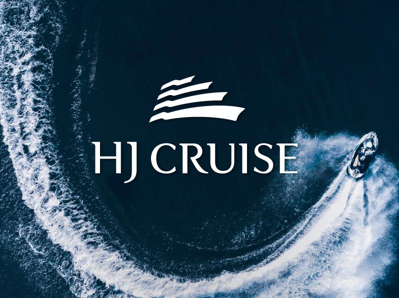
HJ CRUISE & HJ MARINA
Creative Strategy / Branding(BI) / Verbal Identity

THE CHEF'S TABLE
Creative Strategy / Branding(BI) / Verbal Identity / Signage

pigeon
Creative Strategy / Branding(BI) / Packaging

ATHERTON
Creative Strategy / Branding (BI) / Verbal Identity
YNL Design Website Renewal
Creative Strategy / Verbal Identity / Web(UX&UI)

RayZir FS
Creative Strategy / Packaging

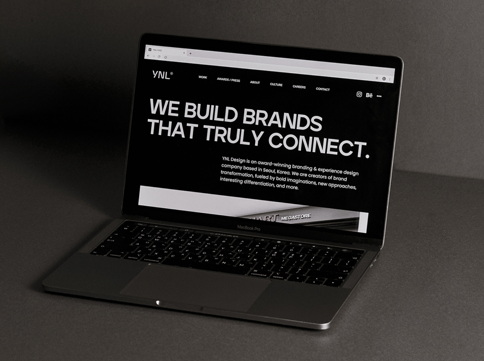
YNL Design
Creative Strategy / Branding(CI) / Verbal Identity / Web(UX&UI)

IROE
Creative Strategy / Branding(BI) / Verbal Identity / Packaging

HJ MARINA CAFE
Creative Strategy / Branding(BI) / Verbal Identity / Packaging

AU CALM THE TERRACE
Creative Strategy / Verbal Identity / Branding (BI)

LOTTE HIMART MEGASTORE
Creative Strategy / Branding(BI) / Verbal Identity / Signage

SCOTT
Creative Strategy / Packaging

Stilla Plastic Surgery & Anti-Aging
Creative Strategy / Branding(BI) / Verbal Identity / Signage

SERENU BLACK
Creative Strategy / Branding(BI) / Verbal Identity / lllustration

LOSHIAN
Creative Strategy / Branding(CI)

MakJi
Creative Strategy / Branding(BI) / Verbal Identity / Packaging / Illustration

Coset
Creative Strategy / Branding(CI) / Verbal Identity

KHASTO
Creative Strategy / Branding(BI) / Verbal Identity / Applications

POOL HOUSE TERRACE
Creative Strategy / Branding(BI) / Verbal Identity / Signage

Voithru
Creative Strategy / Branding(CI) / Verbal Identity
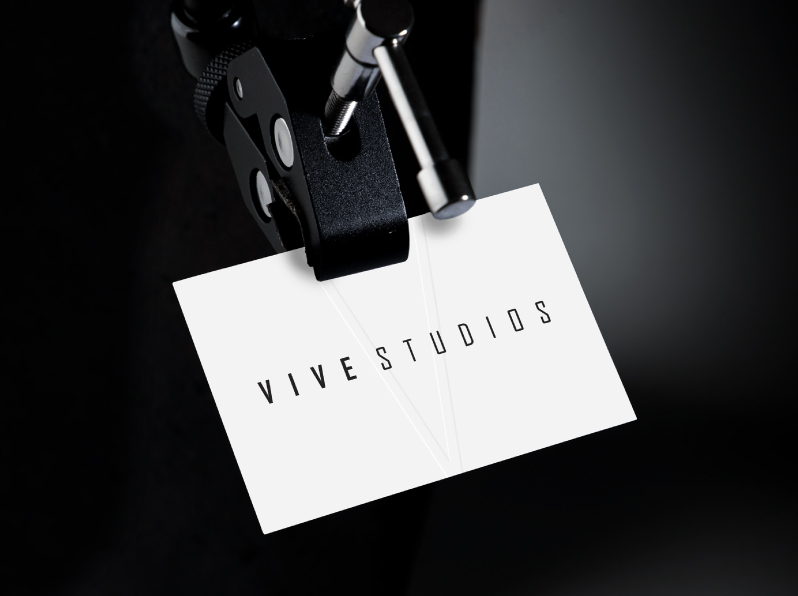
VIVE STUDIOS
Creative Strategy / Editorial / Graphic

HAOBIN
Creative Strategy / Branding(BI) / Verbal Identity / Signage

The Ambassador Seoul A Pullman Hotel The Lounge & Bar / The Kings Signage
Creative Strategy / Signage

Finmate
Brand Naming / Brand Identity / Creative Strategy / Brand Slogan / Brand Tagline / Applications

PRIOR Tax Corporation
Creative Strategy / Branding(CI) / Verbal Identity / Web(UX&UI)

Kitsch Cow Butcher Shop
Creative Strategy / Branding(BI)

Urban Launderette
Creative Strategy / Branding(BI) / Graphic / Signage

SERENU
Creative Strategy / Branding(BI) / Verbal Identity

DAVIDECHOI
Creative Strategy / Branding(BI) / Verbal Identity / Packaging

RAON WOMEN'S CLINIC
Creative Strategy / Branding(BI)

depetz
Creative Strategy / Branding (CI) / Application

LPHYSIO Prestige Fitness & Therapy
Creative Strategy / Branding(BI) / Verbal Identity / Web(UX&UI) / Graphic / Signage

PRIOR WEBSITE
Creative Strategy / Web(UX&UI)

LPHYSIO WEBSITE
Creative Strategy / Web(UX&UI)

COLD SPRING ORGANIC
Creative Strategy / Branding(BI) / Verbal Identity / Packaging / Illustration

OTTOGI GIFT SET
Creative Strategy / Packaging / Graphic

TIME VIP VOUCHER
Editorial / Graphic

PAUL BASSETT
Creative Strategy / Editorial / Graphic

wonderaum
Creative Strategy / Branding(BI) / Verbal Identity

Seoul Arts Learning Center
Creative Strategy / Branding(BI) / Verbal Identity

SYSLEEP Mattress
Creative Strategy / Branding(CI) / Verbal Identity

La MUnir
Creative Strategy / Branding(BI) / Verbal Identity / Packaging
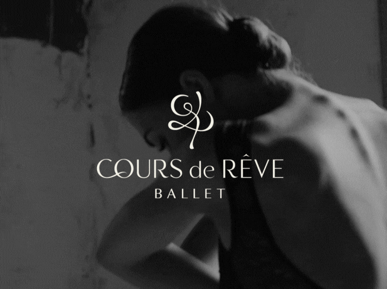
COURS de REVE BALLET
Creative Strategy / Branding(BI) / Verbal Identity

Wink Plastic Surgery Clinic
Creative Strategy / Branding(BI) / Web(UX&UI)

ARTISTRY STUDiO
Creative Strategy / Graphic

DORMIRELAX
Creative Strategy / Branding / Verbal Identity / Editorial

COMME AESTHETIC WEB
Creative Strategy / Web(UX&UI)

RIVER ANIMAL MEDICAL CENTER
Creative Strategy / Branding(BI) / Verbal Identity

D-forest
Creative Strategy / Branding(BI) / Verbal Identity / Illustration / Signage

COMME AESTHETIC
Creative Strategy / Branding(BI) / Verbal Identity

OTTOGI OMU
Creative Strategy / Branding(BI)

Grampus
Creative Strategy / Branding(BI) / Verbal Identity / Editorial / Graphic

HIGH hOLBORN
Creative Strategy / Branding(BI) / Verbal Identity

Jules Diary
Creative Strategy / Branding(BI) / Verbal Identity / Web(UX&UI)

RAON WOMEN'S CLINIC WEB
Creative Strategy / Web(UX&UI)

Mannings & Guardian Store
Creative Strategy / Branding(BI) / Graphic

Incheon International Airport
Creative Strategy / Signage

EMINENT
Creative Strategy / Branding(BI) / Web(UX&UI) / Signage

Maison de MARIANNE
Creative Strategy / Branding(BI) / Packaging / Signage

WINE WORKS
Creative Strategy / Branding(BI) / Packaging

Damtuh Finest Tea Collective
Creative Strategy / Packaging

Diligent Farmer
Creative Strategy / Branding(BI) / Packaging

Damtuh Herbal Tea Special
Creative Strategy / Packaging

MAISON TICIA
Creative Strategy / Branding(BI) / Packaging / Illustration / Signage

Innisfree Green Cafe
Creative Strategy / Graphic / Signage

OASIS Veterinary Surgical Center
Creative Strategy / Branding(BI) / Signage

MS PREtea Cafe
Creative Strategy / Branding(BI) / Packaging / Illustration

SUGARCUP
Creative Strategy / Branding(BI) / Graphic / Signage

THE OTHER BEANS
Creative Strategy / Branding(CI) / Verbal Identity / Signage

KB Card
Creative Strategy / Editorial / Illustration

THE HILL VETERINARY MEDICAL CENTER
Creative Strategy / Branding(BI) / Signage

PENNY LANE
Creative Strategy / Branding(BI) / Packaging / Signage

Cafe Cconnal
Creative Strategy / Branding(BI) / Packaging / Signage

Nature Collection La plusbelle
Creative Strategy / Branding(BI)

STATION NEO
Creative Strategy / Branding(BI) / Signage

IL BIANCO
Creative Strategy / Branding(BI) / Signage